












































Bokuyaba Firefly 开屏动画适配
在上一篇文章 《我心里危险的东西》官网开屏动画复刻 中详细解析了官网动画的实现细节。
本文做了 Firefly 博客的适配,重构为支持全局及单页配置的 Astro 独立组件 OpSplashScreen.astro。
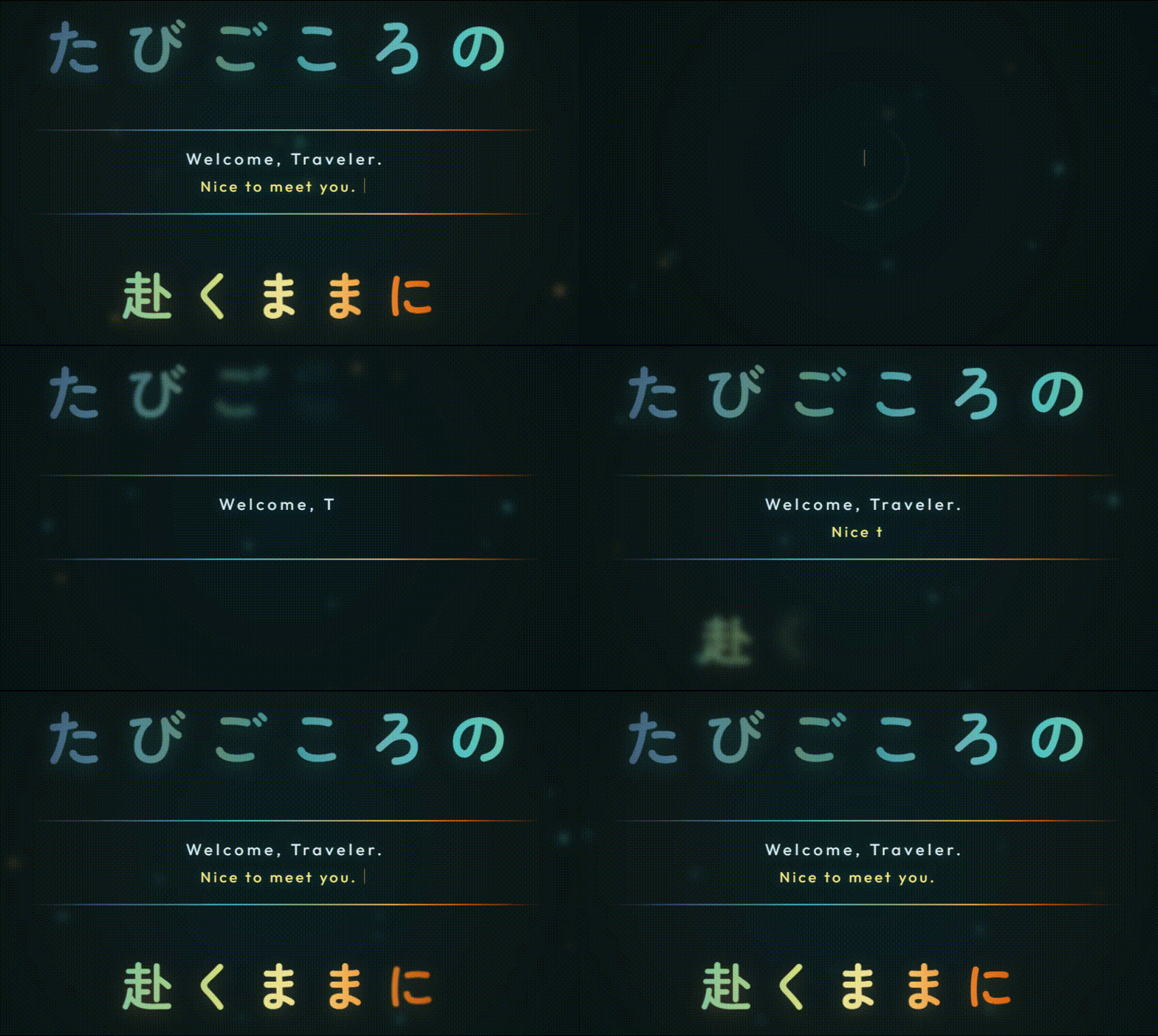
流萤开屏动画效果演示
下图为修改之后的 Firefly 开屏动画效果(或许未来也可以弄个像 Bokuyaba 那样的图片字?不过不知道怎么设计):
一、 如何在当前博客框架中嵌入开屏动画
在 Firefly 博客中,开屏组件采用了集中式全局挂载 + 独立配置文件 + 单页 Frontmatter 覆写 的设计架构。
1. 页面框架挂载点 (src/layouts/Layout.astro)
开屏组件作为顶级 Overlay 挂载在主布局入口中。只需在 src/layouts/Layout.astro 中插入如下判定:
---import OpSplashScreen from "@components/features/OpSplashScreen.astro";import { opConfig } from "@/config";import { isHomePage } from "@/utils/layout-utils";
const isHomePageCheck = isHomePage(Astro.url.pathname);---
<!doctype html><html lang={siteLang}> <body> <!-- 仅在首页且全局开启时渲染开屏组件 --> {isHomePageCheck && opConfig.enable && <OpSplashScreen />}
<div id="app"> <slot /> </div> </body></html>2. 全局与文章预设配置 (src/config/opConfig.ts)
开屏的主备文案、Logo 模式以及 Session 频率控制均在配置文件中统一集中管理:
import type { OpConfig, OpSplashConfig } from "@/types/opConfig";
/** * 流萤 (Firefly) 开屏动画主配置 */export const opConfig: OpConfig = { enable: true, // 是否启用开屏动画 onlyOncePerSession: true, // 同一次浏览器 Session 中是否仅首次进入时显示 textTop: "たびごころの", // 上句大字标题(青绿整句渐变) textBottom: "赴くままに", // 下句大字标题(暖金整句渐变) typewriterLine1: "Welcome, Traveler.", // 中间打字机第一行 typewriterLine2: "Nice to meet you.", // 中间打字机第二行 promptGuideText: "TAP ANYWHERE TO ENTER", // 底部引导提示};
/** * 文章特定开屏预设 (可在 Markdown 的 opSplashPreset 中指定) */export const opSplashPresets: Record<string, OpSplashConfig> = { chinajoy2026: { enable: true, onlyOncePerSession: true, textTop: "巡り逢えた世界", textBottom: "君に届くように", typewriterLine1: "Welcome, Traveler.", typewriterLine2: "Nice to meet you in CJ 2026.", promptGuideText: "TAP ANYWHERE TO ENTER", },};如果要为特定文章指定不同的开屏文案,只需在 Markdown 的 Frontmatter 中添加:
---title: "ChinaJoy 2026 观展记录"category: "Firefly"opSplashPreset: "chinajoy2026"---二、 组件复用与重构 (OpSplashScreen.astro)
OpSplashScreen.astro 相比于原版纯 CSS 9 图层拆分,做了大量适应博客场景的模块化改造:
1. Canvas 2D 萤火虫动态粒子底层
为契合 Firefly 主题,底层新增了 Canvas 2D 萤火虫粒子效果(这个萤火虫粒子后续稍微改一改,或许能独立出来用于网页背景特效?当前博客特效里只有樱花)。
class FireflyParticle { x = 0; y = 0; size = 0; speedX = 0; speedY = 0; opacity = 0; pulseSpeed = 0; colorType = "cyan"; constructor() { this.reset(); } reset() { this.x = Math.random() * width; this.y = Math.random() * height; this.size = Math.random() * 2.2 + 1.2; this.speedX = (Math.random() - 0.5) * 0.35; this.speedY = (Math.random() - 0.5) * 0.35 - 0.18; this.opacity = Math.random() * 0.65 + 0.2; this.pulseSpeed = Math.random() * 0.018 + 0.007; this.colorType = Math.random() > 0.35 ? "cyan" : "amber"; } draw() { ctx.beginPath(); ctx.arc(this.x, this.y, this.size, 0, Math.PI * 2); ctx.fillStyle = this.colorType === "cyan" ? `rgba(76, 195, 198, ${this.opacity})` : `rgba(246, 182, 91, ${this.opacity})`; ctx.shadowBlur = this.size * 4.5; ctx.fill(); }}2. 单字切片与整句连续渐变
为了让自定义的文字标题(如“たびごころの”)在逐字渐进浮现的同时,保持整句文字从左到右连贯一致的线性渐变,这里把字符串分割为单独字符 <span class="char-slice">,并根据字符索引计算背景图偏移位置:
function initTextSlices() { const topContainer = document.getElementById("js-title-top"); const topText = topContainer.getAttribute("data-text") || "たびごころの"; const topChars = Array.from(topText); const topCount = topChars.length;
topContainer.innerHTML = topChars.map((char, index) => { const delay = (CONFIG.startDelayTop + index * CONFIG.staggerTop).toFixed(2);
// 根据当前字符索引百分比计算背景图偏移位置 const bgPos = topCount > 1 ? (index / (topCount - 1)) * 100 : 0;
return `<span class="char-slice" style=" transition-delay: ${delay}s; background-size: ${topCount * 100}% 100%; background-position: ${bgPos.toFixed(1)}% 0; ">${char}</span>`; }).join("");}配套 CSS 采用 -webkit-background-clip: text:
:global(.op-splash-container .char-slice) { display: inline-block; opacity: 0 !important; filter: blur(8px) !important; transform: translateY(-8px) scale(1.08) !important; transition: transform 1s cubic-bezier(0.16, 1, 0.3, 1), opacity 1s cubic-bezier(0.5, 1, 0.89, 1), filter 1s cubic-bezier(0.5, 1, 0.89, 1); -webkit-background-clip: text; background-clip: text; -webkit-text-fill-color: transparent;}3. Swup / View Transitions 生命周期解绑
在 Astro SPA 模式下,页面无刷新跳转时如果不清理定时器与 Canvas 帧循环,会导致内存泄漏或重叠渲染。通过监听 astro:before-swap 事件可实现优雅注销:
document.addEventListener("astro:before-swap", () => { clearAllTimeouts(); stopParticles(); // cancelAnimationFrame document.body.style.overflow = ""; container.remove();}, { once: true });三、 Firefly 颜色参考
参考链接:萌娘百科 - 流萤
background: linear-gradient( left, #425574, #508494, #65866c, #3c969c, #71acaf, #4cc3c6, #7dc8a4, #9fd08a, #dfe482, #eee89d, #e8e390, #f6b65b, #e77a22, #d35303); ████ #425574 (Cold Steel Blue) ████ #508494 (Deep Cyan Muted) ████ #65866c (Sage Green) ████ #3c969c (Peacock Teal) ████ #71acaf (Soft Mint) ████ #4cc3c6 (Firefly Primary Cyan) ████ #7dc8a4 (Spring Mint Green) ████ #9fd08a (Soft Lime Green) ████ #dfe482 (Warm Lemon) ████ #eee89d (Pale Gold) ████ #e8e390 (Sunny Yellow) ████ #f6b65b (Firefly Primary Amber) ████ #e77a22 (Deep Orange) ████ #d35303 (Vivid Rust Orange)
通过以上解耦与封装,Firefly 主题成功实现了动画效果的模块化复用与自由扩展!
支持与分享
如果这篇文章对你有帮助,欢迎分享给更多人或打赏支持!